Your cart is currently empty!
Category: Inspirational
An easy creative solution to a BIG cardmaking Blunder

What to do when you’ve invested time and materials, but then it all goes sideways? When that happens to me I hate having to scrap the time and materials invested in the piece.
Errors are opportunities for creativity! Read on to learn more ….
Let’s get Started:
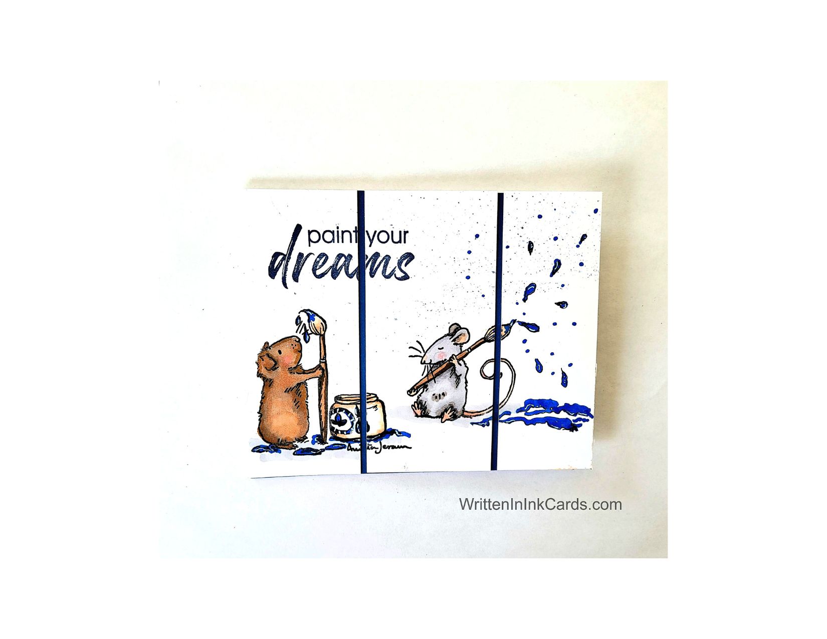
Card Base: 5.5 x 8.5, scored and folded at 4.25
Border Layer: 5.5 x 4.25
Card Face: 5.5 x 4
Card Face:
I stamped the images in black Memento ink and colored them with alcohol markers. I was happy with the result, as coloring isn’t my strong suit.
Then I put this aside for a period of time, trying to decide how to finish the piece. When I picked it back up again I was dismayed to see that it had been sitting too close to something messy – there was a fine blue spatter in the upper right. (Probably from cleaning a stencil, and simple carelessness with my work!). How to salvage the time and materials…. ???
I added both large and small drops of paint above the brush. I used a fine liner to outline the drops and a blue alcohol marker to fill them in. I also added small dots of blue marker here and there to bridge between the fine spatter and the larger drops. It worked – I was delighted with the result, I had successfully camouflaged my error!
I carried this one step further by creating puddles of paint under the brush. (There were puddles around the paint pot, but not under this paintbrush).
I used a white gel pen to add accents here and there in the scene.
I put the card face into my stamp positioner and added the sentiment.
I cut the card face into three panels, 1 ⅓” each.
Assembly
I glued the border layer to the card base.
I glued the three pieces of the card face onto this, spacing evenly.
Final Thoughts:
I love Anita Jeram’s work, and was so happy with the images as placed and coloured. (I don’t pretend to be an expert with any form of colouring, so when I get something that I’m satisfied with, I’m happy!).
Then I was dismayed to notice the spatter, and finally, happy again when the problem was resolved.
Happy – dismayed – happy. Sounds like a movie theme! 😆
Of course if you want to avoid the need for a rescue operation, putting the card in a safe spot is definitely the way to go.
Supplies: (and links where possible)
I have listed which products I have used, and where they may be purchased. It’s a huge marketplace; in most instances, there are multiple sources and many alternatives.
Stamps: Paint the Town, Colorado Craft Co.,
Versafine Onyx, Simon Says Stamp
Memento Ink: Stampin’ Up!
Alcohol Markers:
Stampin’ Blends: Stampin’ Up!
Copics: Wallacks
Fineliners: Amazon
White Gel Pen: Arteza, Amazon
Adhesive: Tombow Aqua, Michaels
Card Base & Card Face: Accent 100 lb., Amazon
Create a handmade card that celebrates the Simple Moments

Sometimes the simple pleasures really are the best; it could be a smile from a loved one, sunshine on a spring day, or flowers in a vase.
Would you like to experiment with a design like this? You’ll find a supply list below, including a link to the stencil I used from A Colorful Life Designs. Follow the link and use discount code ChrisFan10 to save 10% on your entire order! (Master Creator Bundles are excluded as they already have a 20% discount built in.)
Let’s get Started:
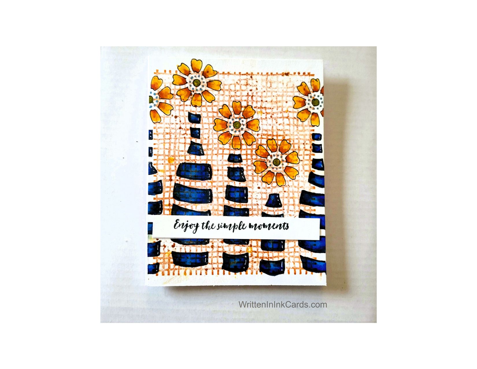
Card Base: 5.5 x 8.5, scored and folded at 4.25
Card Face: 5.5 x 4.25
Card Face:
- I inked up the background stamp with orange ink, and laid it face up on my desk: then I placed the card face on top, doing my best to keep it straight.
- I laid a piece of scrap copy paper over this and ran my fingers over the entire surface to ensure ink transfer. (This is my preferred method when using a background stamp.
- I put the card face on my Grip Mat and used a black fineliner to trace the pattern onto the card face.
- I coloured the images with alcohol markers, adding white highlights with gel pen.
- I used a blue gel pen to add the dotted circle around the center of each blossom ( it doesn’t look blue in the image, but it is).
- I used a clear metallic pen to add sparkle to the center of each blossom: the centers had been coloured green with alcohol marker and the addition of the metallic ink activated that, creating a pretty greenish gold.
Other:
- I looked through my sentiment binder and selected one that was a good size for this bold image, and I felt this sentiment worked well too.
- The sentiment had been created on very light cardstock: I added a piece of heavier cardstock to the back to create stability.
Assembly
- I glued the card face directly to the card base.
- I added the sentiment as shown.
Final Thoughts:
I love this stamp and stencil combination: they work so very well together.
I was initially concerned about the orange ink showing through the colouring but then decided that it would just add depth and visual interest. I don’t mind the result, what do you think?
Supplies: (and links where possible)
I have listed which products I have used, and where they may be purchased. It’s a huge marketplace and in most instances, there are multiple sources and many alternatives to choose from.
Stencil: Bottled Posies, A Colorful Life Designs
Waffle Flower Grip Mat, 8.5 x 6.5, Scrapbook.com
Versamark Embossing Ink: Simon Says Stamp
Stamps: Weave, Technique Junkies (no longer available)
Fineliner: Amazon
Metallic Gel Pen: Sakura Gelly Roll, Amazon
White Gel Pen: Arteza, Amazon
Ink: Stampin’ Up!
Blending Brushes: Stampin’ Up!
Memento Ink: Stampin’ Up!
Alcohol Markers:
Stampin’ Blends: Stampin’ Up!
Copics: Wallacks
Adhesive: Tombow Aqua, Michaels
Card Base & Card Face: Accent 100 lb., Amazon
Do you have comments or thoughts to share on this design? Drop me a line in the Comments Section below – I’d love to hear from you!
You can also use the Comments Section to be added to the list, and notified when I release new work.
How to Make a Stunning Debossed Card

Let’s get Started:
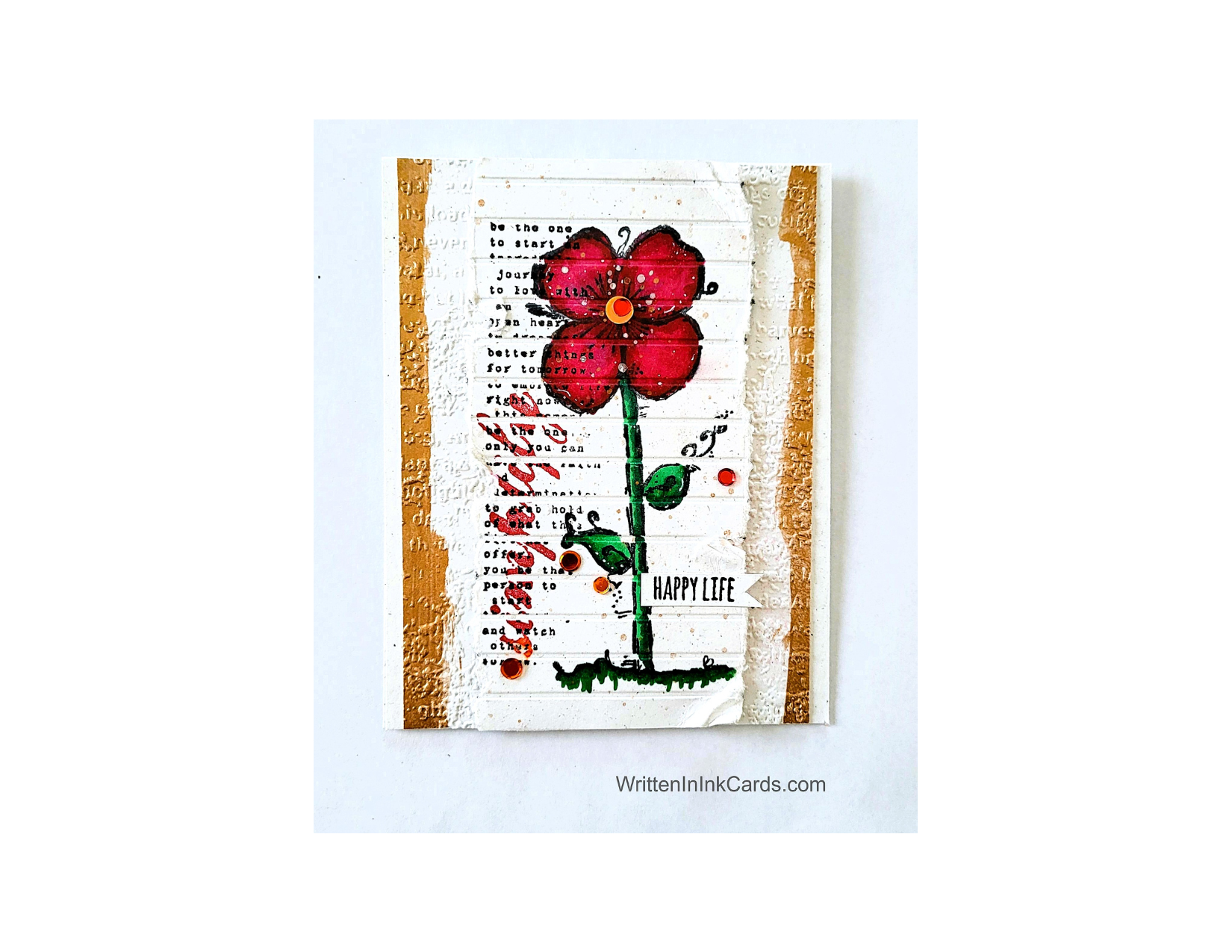
Card Base: 5.5 x 8.5, scored and folded at 425
Border Layer: 5.5 x 4
Card Face: 5.5 x 4 (before tearing)
I had a card face which had been started but put aside: I had originally swiped black ink onto the surface and then I had put it into a striped embossing folder and run it through the Big Shot… and then put it aside. I picked this up one day, and thought “what would happen if I used the back of this as a base for an image? The stripes are debossed that way … it might be interesting.” And so it began.
Card Face:
- I stamped the flower onto the card face, followed by the long sentiment using black Memento ink for both. I overlapped the two deliberately.
- I coloured the flower using alcohol markers. While colouring the blossom, I accidentally filled in one of the debossed channels: there was nothing to do but continue doing that as I continued colouring the image.
- I wanted more colour, so I added the Simplify in red ink, to match the flower.
- I tore both sides off close to the image, distressing the edges quite a bit.
Other:
- I used a wide flat brush with gold watercolour paint and created a gold strip down both sides of the border piece: I deliberately created a jagged, irregular line as I went. Once this was dry, I placed it in an embossing folder and ran it through the Big Shot.
- I added spatter to the card face using both silver and gold watercolour paint.
- I stamped the “happy life” sentiment onto a narrow strip of scrap paper and then used my snips to create the flag on the right.
Assembly
- I glued the border layer to the card base, centering vertically.
- I put dimensional foam on the back of the card face and added this to the border layer, again centering vertically.
- I glued the sentiment onto the card face as shown.
- I added bling randomly to the card face.
Final Thoughts:
I’m really happy with this card: I like the look of the image stamped onto the debossed card face, and the tiny sentiment on the stem.
If I were to do this again, I would lightly touch a few of the torn edges of the card face with the same gold ink used elsewhere. This would have tied that element in quite nicely.
Supplies: (and links where possible)
I have listed which products I have used, and where they may be purchased. It’s a huge marketplace; in most instances, there are multiple sources and many alternatives.
Stamps: Bloom and Simplify, Unity Stamps (retired)
Metallic Watercolour Paint: Amazon
Ink: Stampin’ Up!
Blending Brushes: Stampin’ Up!
Versafine Onyx, Simon Says Stamp
Memento Ink: Stampin’ Up!
Alcohol Markers:
Stampin’ Blends: Stampin’ Up!
Copics: Wallacks
Bling: A Colorful Life Designs
Adhesive: Tombow Aqua, Michaels
Card Base & Card Face: Accent 100 lb., Amazon
Do you have comments or thoughts to share on this design? Drop me a line – I’d love to hear from you!
How to Rescue Your Card Designs from Mistakes

If you’re new, or experienced, or anything like me (!) you have run into situations where you need to rescue your card from a blunder.
Let’s get Started:
Card Base: 5.5 x 8.5, scored and folded at 4.25
Border Layer: 5.5 x 4.25
Card Face: 5.5 x 4
Card Face:
I stamped the images in black Momento ink and coloured them with alcohol markers.
Then I put this aside for a period of time, trying to decide how to finish the piece. When I picked it back up again I realized it had been sitting too close to something messy – there was a fine blue spatter in the upper right. (Probably from cleaning a stencil, and simple carelessness with my work!). How to salvage the time and materials…. ???
I added both large and small drops of paint above the brush. I used a fine liner to outline the drops and a blue alcohol marker to fill them in. I also added small dots of blue marker here and there to bridge between the fine spatter and the larger drops. It worked – I had successfully camouflaged my error!
I carried this one step further by creating puddles of paint under the brush. (There were puddles around the paint pot, but not under this paintbrush).
I used a white gel pen to add accents here and there in the scene.
I put the card face into my stamp positioner and added the sentiment.
I cut the card face into three panels, 1 ⅓” each.
Assembly
I glued the border layer to the card base.
I glued the three pieces of the card face onto this, spacing evenly.
Final Thoughts:
I love Anita Jeram’s work, and was so happy with the images as placed and coloured. (I don’t pretend to be an expert with any form of colouring, so when I get something that I’m satisfied with, I’m happy!).
Then I was dismayed to notice the spatter, and finally, happy again when the problem was resolved.
Happy – dismayed – happy. Sounds like a movie theme!
I’m so happy that I decided to rescue this card.😆
Supplies: (and links where possible)
I have listed which products I have used, and where they may be purchased. It’s a huge marketplace; in most instances, there are multiple sources and many alternatives.
Stamps: Paint the Town, Colorado Craft Co.,
Versafine Onyx, Simon Says Stamp
Memento Ink: Stampin’ Up!
Alcohol Markers:
Stampin’ Blends: Stampin’ Up!
Copics: Wallacks
Fineliners: Amazon
White Gel Pen: Arteza, Amazon
Adhesive: Tombow Aqua, Michaels
Card Base & Card Face: Accent 100 lb., Amazon